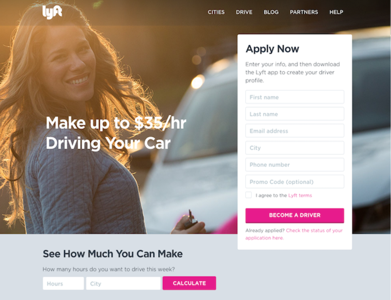
Here is my list of the 6 things you must do with your landing page to boost conversions. You’re probably wondering, “what, only 6?”. Yes, you are right to wonder. There are actually many elements that go into a good landing page, but I picked six of the more important ones to focus on today and show some examples. If you like this post, share with your friends and I’ll publish a followup blog with some more elements.
Well, with out further ado… I give you 6 elements of good landing page design:
- Grabs You
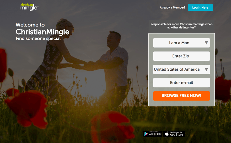
Try to make your landing catchy, eye-candy. I don’t mean they should just be cool images, but rather the design should right away engage a visitor with relevant images, layout. etc.
- Social Proof
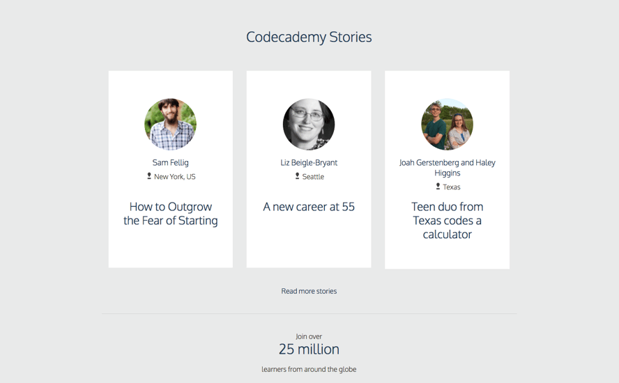
Landing Pages are your first contact with a visitor, building credibility is essential. You can do this by presenting value to your visitors, using numbers, adding contact info, showing testimonials, press coverage and social media proofs. Another very popular way is to showcase testimonials, such as this landing page section from Codecademy.com.
- Build Trust

Landing Pages are your first contact with a visitor, building credibility is essential. You can do this by presenting value to your visitors, using numbers, adding contact info, showing testimonials, press coverage and social media proofs. One of the ways I like is to showcase your certifications to kind of, you know, tell people you know what you’re doing.
- Effective Images
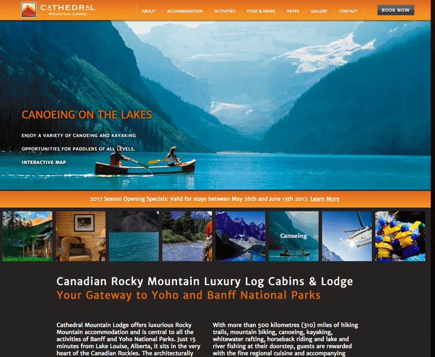
Although similar to #1 above, effective images do more than just grab you by the eye-balls, they can actually help to build trust, interest and desire. In this example, the gorgeous images almost compel your imagination to transplant you to this vacation spot and start daydreaming about being there.
- Action Compelling Copy Content
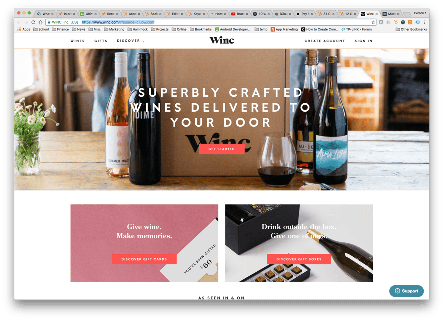
Like we discussed in Converting With Landing Page Design, the entire goal of the landing page is to persuade the visitor to perform one action. Signup for a newsletter, subscribe for a free or paid course, download an ebook, or any other step you desire your visitor to take. So naturally, the written content of your landing page must contribute toward getting that one step taken. The content should build desire, trust and whatever else is necessary to help achieve that one action being take by the website visitor.
- Clear Call To Action

There are two elements here. 1. You need to make it very obvious what the landing page visitor is supposed to do. Click a button, give an email, login using Facebook, etc. 2. Believe it or not you actually must tell the visitor to take that one action step. For example on a signup box or button, “Join Now”, “Start Making Money Today”, “Start Dating Girls Tonight”… you get the idea.
Conclusion
Well that wraps up our 6 elements of landing page design. Try applying these elements everytime you begin a landing page development project and track how your conversions improve. There are many ways to increase engagement on your website, but when it comes to developing quality landing pages, your chances of converting more of you web vistitors into customers will really increase if you consistently apply this elements to your landing pages.
And now for the shameless plug, if you have any questions about your landing pages or would like our help, feel free to call us. We are a Los Angeles Web Design company, but because we are primarily digital marketers, we love creating and improving Inbound Marketing, Google Adwords and Facebook PPC campaigns.

 +1 800-906-1504